Scientific conferences are a preeminent platform for researchers to showcase their findings, exchange ideas, and network with peers. The presentation slide is the building block of any scientific presentation. However, a successful conference presentation requires more than just great research. The presenter needs to possess excellent communication skills and need to design slides for optimal effect so that the design elements can convey meaningful information and keep the audience engaged and informed.
A common erratum often found in most conference presentations is using designs that heavily rely on bullet points and massive chunks of text. Often, presenters aim to include as much information in just one slide which leads to such design mistakes. The slides just serve as a teleprompter for the speaker, and the audience recalls boredom instead of an enlightening experience. Here, we have summarized the key factors that dictate what makes a good conference presentation slide.
Create your storyboard first:
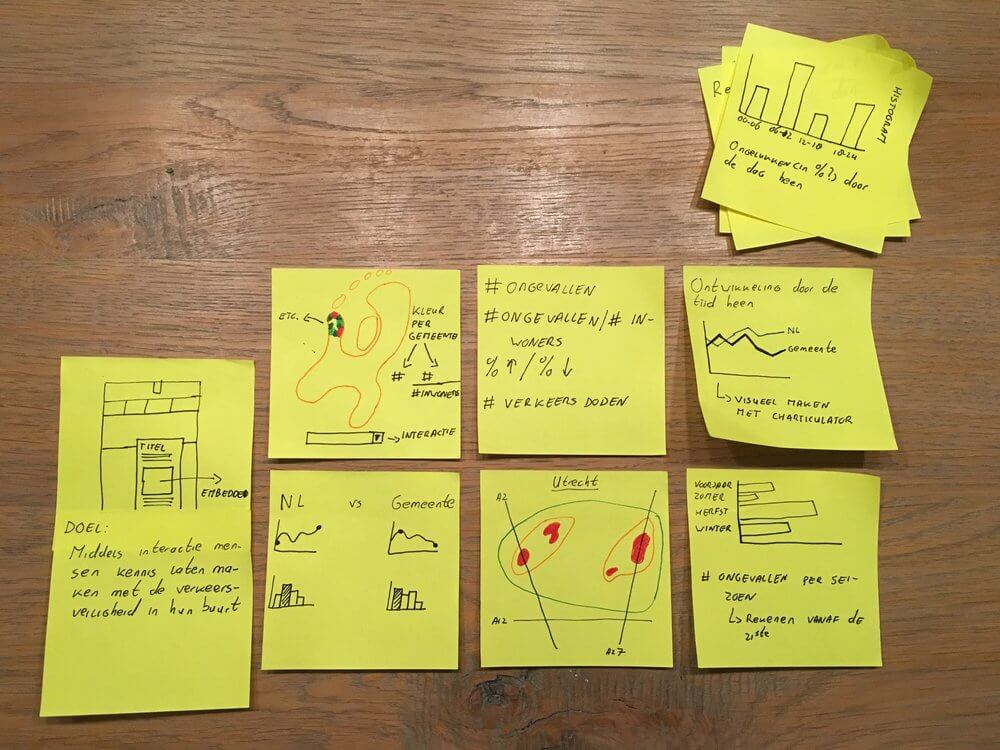
Most often when our supervisor or PI asks you to prepare a presentation for the upcoming conference, we straight open the PowerPoint or any other open-source presentation software and start making slides. Well, that seems the usual way, but it might not be the best approach. Grab a pen and paper and start sketching your slides. Make headlines for each slide, try to write down the information that you will deliver in bullet points and make a story line. If pen and paper do not work for you, grab sticky notes and start sketching your stories. Place them on a wall and arrange them in the best possible orders so that they fit together for the story that you want to tell the audience.
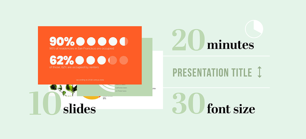
How many slides do you need?
“The More the Merrier” this is not true for scientific presentation. Most presenters want to use too many slides. But you should keep in mind that your PowerPoint slides are just the support material for your message or story you want to deliver, not the story itself. Therefore, you should always ask yourself first “how many slides do I need to tell my story to my audience?”
Is there any thumb rule? Some might tell you to constrain your presentation to 10 slides. Well, this might work for a 20-minute presentation, but what if you give a talk for 30 minutes. Should you have 100 slides for a one-hour talk? The simple answer will be NO. You should always focus on developing your contents first to complete your story, and then decide how many slides you will need to put them together.
Give only one piece of information in each slide:
You should give your audience only one piece of information or idea per slide. Do not give too much information, it just dilutes your core message and distracts your audience from absorbing the core information. You should always deliver one key point so that your audiences can absorb it and thus you can make sure that everyone is getting the same message. This is a key element for a successful presentation for conference, and will distinguish among expert presenters and others.
Use Visuals effectively:
A single well-designed diagram can eliminate the need for using multiple bullet points in one slide. Visual communication is a very powerful tool to communicate your ideas. It is often said, a picture is worth a thousand words. As a rule of thumb, you should almost never have any slide that only contains text. Instead of using multiple bullet points, create a visual block diagram. You do not need to create a complex sketch, sometimes a simple block diagram makes it easier for the audience to follow. Use graphs or relevant images when needed. But make sure that you are not overkilling your individual slide with too many visual elements.
Be consistent:
Be consistent with your font types, sizes, and the colors that you will use throughout your slides. Choose one font for your headers and another for your body text. Sans-serif fonts are often recommended for PowerPoint because they are clear and easy to read. The minimum font size should be 24 points. Make sure you consistently use the same font sizes for headlines and body texts. If you are choosing different colors for designing your slides make sure they have a stark contrast with your slides background. Use color combinations and palettes that can be understood by those with different forms of color blindness. Most often your organization has specific PowerPoint templates with detailed guidelines for color palette, fonts and design elements. Try to follow them properly.
Improve your slides through practice:
Like any other written document your PowerPoint slides need a review. We often look for any spelling mistakes or typos or any inconsistencies with font sizes etc. Yes, those need to be taken care of. But the most important question you should always ask yourself first “Does the story flow?” Here comes the hard part. You should take as much as time you need and then go through all your slides from the very beginning and rehearse the story that you want to tell. Try to identify the discontinuity, pinpoint those slides where you gave unnecessary information or where you feel that there is a gap. It’s been said before, if any information does not fit with your story just cut it out. Improvise your slides through practice till the eleventh hour.
If you dig through internet, you will find plenty of articles and books that provides wonderful guidelines for designing presentation for conference. If you want to learn about designing a poster for scientific conference, you may follow this article. On a side note, no matter which guidelines you follow always remember that slides or posters are just an aid for you to tell the story to your audience. If you fail to deliver the story no matter how good your design is, the audience will not get the right message.
I like this web site very much, Its a real nice position to read and
obtain info